CSS Styling
Custom CSS styling may be written as follows:
.cs-wrapper
{ background-color: #afbce1; }
.cs-login-logo
{ background: url(//abc.def.com/example); }
.cs-header
{ background-color: #0d66b2; }
.cs-button
{ color: #0d66b2; background-color: #d7ddf0; }
.cs-button:hover
{ color: #d7ddf0; background-color: #0d66b2; }
.cs-button-aslink
{ top: 240px; }
More advanced, custom CSS styling configurations are possible. One example is shown below.
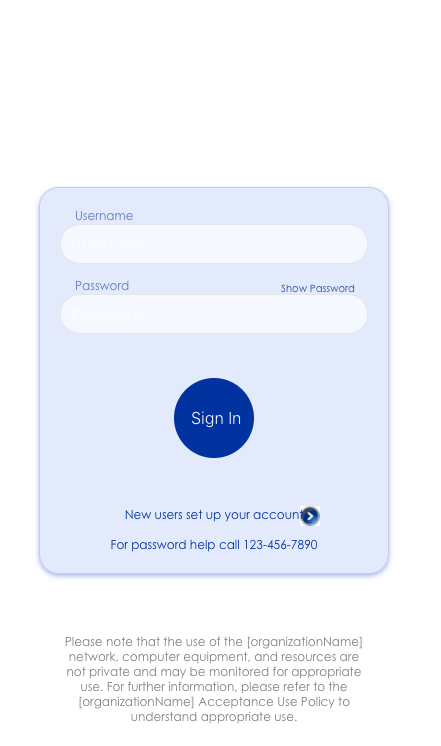 |
The whitespace above the light blue box containing the username and password fields is reserved for the official organization logo. The CSS for this particular configuration for use as a representative example to edit is as follows:
.cs-body, .cs-wrapper {
    background-color: #fff;
    font-family: 'Century Gothic', Arial, sans-serif;
}
.cs-container {
    position: relative;
}
.cs-header {
    display: none;
}
.cs-login-logo {
    margin: auto;
    width: 192px;
    height: 100px;
    margin-bottom: 40px;
    background-image: url(http://[yourOrganizationLogoUrlWithImageExtention);
    background-size: 192px 102px;
}
.cs-login-container {
    text-align: center;
    color: #0032a0;
    font-size: 16px;
    clear: left;
    padding: 20px;
    border: 1px solid #c4cfe6;
    background: #E3EAFC;
    border-radius: 20px;
    box-shadow: 0px 2px 7px rgba(100,140,220,.6);
}
.cs-login-container:after {
    content: "For password help call 123-456-7890";
    font-size: 12px;
}
.input {
    display: block;
    width: 100%;
    height: 40px;
    margin-bottom: 15px;
    padding-right: 10px;
    padding-left: 10px;
    background-color: #F6F8FF;
    border-radius: 3px;
    color: #445963;
    outline: 0;
    border: 1px solid #e6e6e6;
}
.cs-button-wrapper {
    margin: 0;
}
.cs-button[type="submit"] {
    background-color: #0032a0;
    color: #F9F9F9;
    width: 80px;
    height: 80px;
    text-indent: -99999px;
    line-height: 0;
    border-radius: 100px;
    margin: 40px 0;
}
.cs-button[type="submit"]::after {
    content: "Sign In";
    text-indent: -18px;
    display: block;
    line-height: initial;
    font-weight: 300;
}
.cs-button[type="button"] {
    background-color: transparent;
    text-indent: -99999px;
    line-height: 0;
    background: url(https://www.wpclipart.com/signs_symbol/button/
        metal_buttons/arrow_button_metal_blue_right.png)
        240px center no-repeat;
    background-size: 20px 20px;
}
.cs-button[type="button"]:hover {
    background-color: transparent;
}
.cs-button[type="button"]::after {
    content: "New users set up your account";
    text-indent: 0;
    display: block;
    color: #0032a0;
    font-size: 12px;
    font-weight: normal;
    font-family: 'Century Gothic', Arial, sans-serif;
}
.cs-nav-next-button {
    background-image: none;
}
.claim-account-text, .cs-heading-container {
    display: none;
}
.need-help-link {
    margin: 0;
    display: inline-block;
    position: absolute;
    top: 310px;
    right: 55px;
}
.cs-button-aslink {
    color: #2749A5;
    font-size: 10px;
    float: none;
    margin: 0;
}
.button:hover {
    background-color: #021a4c;
    transition: background-color 60ms ease-out;
}
.placeholder-container {
    position: relative;
}
span.placeholder-text {
    display: block;
    top: 0;
    left: 15px;
    color: #2749A5;
    font-size: 12px;
}
.placeholder-input {
    position: relative;
    top: 16px;
    border-radius: 30px;
}
.input-toggle {
    background-image: none;
    width: 80px;
    top: -2px;
    color: #2749A5;
}
.input-toggle::after {
    content: "Show Password";
    font-size: 10px;
}
#pwd {
    margin-top: 30px;
}
::-webkit-input-placeholder { /* WebKit browsers */
    color:    #fff;
}
:-moz-placeholder { /* Mozilla Firefox 4 to 18 */
    color:    #fff;
    opacity:  1;
}
::-moz-placeholder { /* Mozilla Firefox 19+ */
    color:    #fff;
    opacity:  1;
}
:-ms-input-placeholder { /* Internet Explorer 10+ */
    color:    #fff;
}
.error-message {
    margin-bottom: 0;
    margin-left: 16px;
    padding-top: 5px;
    font-size: 12px;
}
.content:after {
    content: "Please note that the use of the [organizationName]
        network, computer equipment, and resources are not private
        and may be monitored for appropriate use. For further
        information, please refer to the [organizationName]
        Acceptance Use Policy to understand appropriate use.";
    text-align: center;
    width: 310px;
    margin: 40px auto;
    font-size: 12px;
    color: grey;
}